Subscribe For Free Updates!

We'll not spam mate! We promise.

Friday 23 March 2012

Facebook data reveals users' romantic and break-up habits

A new report put out by Facebook’s data scientists highlights the patterns users make when they break and begin romantic relationships. The Facebook data is taken from 2010 and 2011.
In the wide view, there are two points in the year that are the best for relationships: February and December. February 14 and 15, dates that coincide with Valentine’s Day, are favorable for new relationships. Christmas time, December 24 and 25 are also prime times for pairing or patching for romance. February 14 had 49 percent more new relationships over break-ups, and Christmas Day had 34 percent. December in general showed a “net gain for romance,” as 4 percent more people began new relationships than didn’t.
Across the demographics of under 25, 25 and 44, and those 45 and over, the summer months generally are bad for relationships. The months of May through August are lower than the other months of the year for 2010 and 2011. December seems have the most extreme net gain for those under 25, and of course February is good across all demographics.
Daily, if you want to know when a break-up is going to happen, Facebook users take the HR approach: fire on a Friday. Friday and Saturday seem to be the top break-up days for those in the older age groups, though the under 25 group seems to like their break-ups on a Thursday. Sunday and Monday for all age groups are the peaks for new romancing across all age groups, as well as Thursday for everyone except the under 25. Facebook’s data scientists believe the explanation for the end-of-week break-ups could be because people see the weekend as prime for easing the burden of ending a relationship, or for going out and starting up new social ties.
Of course, these numbers aren’t completely exact, as people may not disclose accurate relationship changes all the time on their Facebook profile. Still, it’s interesting to see the ebb and flow of romance in these social networking numbers.

Monday 19 March 2012

New Nokia 808 PureView with 41 MP CAMERA


Nokia is mainly popular for its mid budget mobile phones equipped with features that most people like. Although not remains in a big news like Apple and Samsung do but this time Nokia just stunned the technology world with its new mobile handset Nokia 808 PureView featuring 41Mega Pixel camera.

Yes you read it right no one have ever seen such a high range of camera in mobile phone. This cellphone is really a good news for photographers means they don’t have to carry there heavy and bulky digital camera’s with them. Nokia released this phone in MWC 2012 now lets review it and see if they are promoting it rightly or not.

The Design.

I think that one of the drawback of this handset is its size and thickness but it have to be to accommodate the 41MP camera. If you want such a high end feature than you should compromise on it. Again its on a heaver side when it comes to its weight with staggering 165 grams you will definitely feel it when you put it into your pocket.


Screen Size and Display.

Not the biggest of touch screen only 4 inches wide as you may see in other Nokia mobile phones like Nokia Lumia 900 with 4.3 inches wide screen. With AMOLED capacitive touchscreen, 16 million colors and 360 x 640 pixels resolution thought its not the brightest of screens present in the market. That’s why this smartphone is not too big and not too small from my likings. It contains latest AMOLED and ClearBlack screen technologies for a smooth and crystal clear sharp images. It even displays perfectly in a full bright shinny day which means you can enjoy it while you are on the go to your holidays.

Processor and Memory.

This is not the main feature of this phone instead its has same 1.3GHz single-core processor based on ARM11 architecture used by Nokia in all other top models. With 1 GB ROM and 512 MB RAM this beast it quite capable of playing smooth Nokia Belle experience. With 16 GB internal storage and 32 GB external memory card support this is rally a portable music station for music lovers.


Software.

As Nokia has already rolled out its Symbian operating system for mobiles and they adopted Android OS but surprisingly they have again shifted there focus from Android to Nokia Belle platform with Feature Pack 1 enhancements. Software is very responsive and its multiple home screens make sure that all your applications are easy accessible and quickly too.

Camera.

The feature which makes the Nokia 808 PureView popular is its 41 Mega Pixel camera with Carl Zeiss optics. Gone are the days when you have to used digital camera for high end photography. The camera application consists of basic controls and capturing images on 4 inch touch screen device is really a joy. With xenon flash and LED light you will definitely be able to capture images in dark. This handset is also capable of capturing full HD 1080p resolution video.


Connectivity and Battery.

As you can expect in high end mobile phone it has all the connectivity options like Wi-Fi, Bluetooth, GPRS, Edge, NFS and microUSB. It has heavy 1,400 mAh battery with stand-by time of Up to 465 hours and Talk-Time of up to 11 hours.

Wednesday 14 March 2012

Samsung Galaxy SII


Let's start this review by getting one thing out of the way first: the Samsung Galaxy S II is the best Android phone on the market, by far. It may also be the best smartphone on the market, period, even if we think this ultimately comes down to personal preference. The Galaxy S II combines one of the biggest and best screens on the market, with blazing performance, functional, stable software and decent battery life.
The Samsung Galaxy S II is constructed largely from plastic, but we don't think this detracts from its overall appeal. In fact, we think it actually enhances it purely for the fact that the Galaxy S II is just 8.49mm thick. This makes it thinner than the iPhone 4 and likely the thinnest smartphone in the world.
The plastic construction means the Galaxy S II weighs a very light 116g, but its sheer size makes it comfortable to hold, and easy to slip into your pocket. The design does not feel flimsy or poorly constructed, and we like the attractive carbon-like finish on the rear battery cover. Although this part of the phone is thin, difficult to remove and does initially feel a little flimsy, it doesn't rattle or creak once clicked into place.

The Samsung Galaxy S II's design may not evoke the same plaudits as competitors like the HTC Desire HD, which is constructed from a single block of aluminium, but Samsung seems to have struck a near-perfect balance with size, weight and aesthetic appeal.
The Samsung Galaxy S II has a physical (tactile) home key, along with touch sensitive back and menu buttons. The power/lock screen button is perfectly positioned on the right, making it easy to access single-handed, while the same applies to the left-mounted volume controls. The only missing features are a notification LED and a physical camera shutter key. It's hard to keep the Galaxy S II still when taking a photo with the onscreen shutter button.
The killer feature of the Samsung Galaxy S II is its 4.3in Super AMOLED Plus display. It's one of the best screens we've seen on a smartphone to date, producing vivid colours, superb viewing angles and rich brightness.


Sunlight legibility is also superb. On full brightness, the Galaxy S II's screen can easily be seen in strong direct sunlight. These attributes combined with the large 4.3in size mean the Galaxy S II is the perfect smartphone for video playback. The iPhone 4's 3.5in screen looks almost tiny in comparison, and the extra screen real estate really makes a difference in day to day use, particularly given Android's widget-focused home screens.
Two minor sour points concerning the display are the fact that some images do appear to look a little oversaturated, and that text is sometimes hard to read, especially when zoomed out. The latter is particularly evident in the web browser. Small fonts seem to look worse than other Android phones with the same resolution. The Samsung Galaxy S II's WVGA resolution of 800x480 can't quite match the iPhone 4's "retina" resolution (960x640), or the qHD resolution (540x960) of the Motorola Atrix, but the resolution itself doesn't seem to be the cause. We feel this might be a rendering issue.

T
he Samsung Galaxy S II has a 4.3in Super AMOLED Plus display that produces vivid colours, superb viewing angles and rich brightness.

Software

The Samsung Galaxy S II runs the latest version of Google's Android operating system, 2.3 "Gingerbread", and also features Samsung's TouchWIZ 4.0 UI overlay. Although it is not as comprehensive as HTC's Sense UI seen on phones like the HTC Desire and Desire HD, TouchWIZ UI is both attractive and functional. The default Samsung weather, clock and power widgets quickly found a permanent home on our screen, and you can easily customise the main app menu by creating folders. Annoyingly, you can't automatically sort the icons in the main menu, though you can move them around manually.


Samsung has included a number of other nifty functions in its TouchWIZ software. Swiping left on a contact in your phonebook will immediately call that person, and swiping right will message them. You can also turn the Galaxy S II over on a desk or table to silence an incoming call. Other "motion based" features include the ability to tap and hold the screen at two points and tilt back and forth to zoom in and out of the browser or gallery, and move a selected home screen icon to another screen by holding it and moving the phone left of right. These features will wow onlookers, but aren't practical for day to day use.
The Galaxy S II also comes with four Samsung software hubs: the social hub, readers hub, game hub and music hub. Of these four, we found the readers hub (which integrates electronic newspapers, books and magazines) the most useful, even if is just quick access to Kobo and Zinio apps which are freely available to download from the Android Market. As for the other Samsung hubs, we prefer using separate apps to social hub (which groups social networking, email and IM accounts), the music hub is a pointless music service, and the games hub simply searches for and lists compatible games in the Android Market.
There are a few niggling aspects about Samsung's TouchWIZ UI that we don't like, but none are a deal breaker. The default lock screen is slow to slide and feels sluggish on such a top end phone, the TouchWIZ home screens don't scroll as fast as we'd like (even if the overall experience is smooth), and the phone is sometimes slow to wake when unlocked. Finally, we like Samsung's default keyboard in general, but it has annoyingly replaced the comma key with a voice input button.
The Galaxy S II comes with a Vlingo Voice Talk app that can be activated by double tapping the home button. Like most voice activated software, the process is slow and the results are often hit and miss, though it does work reasonably well when combined with Google Maps Navigation in the car, provided you are speaking close enough to the microphone.


We found the Readers Hub, which integrates electronic newspapers, books and magazines, the most useful out of the Samsung software hubs

Performance and battery life

The Samsung Galaxy S II is powered by a 1.2GHz dual-core processor and this means one thing: it's fast. Very fast.
This is most evident when browsing the web: the Galaxy S II loads pages much faster than the iPhone 4 when connected to the same Wi-Fi network, and also breezes through most everyday tasks without a hint of slowdown. The web browser has full Flash video support, while pinch to zoom and scrolling are smooth and fast. The Galaxy S II is very stable, and we did not experience a single crash in over a week of use. It's clear it is not a half-baked phone that was rushed to release, and feels very much like a finished product, a feat than many other Android phones can't claim.
The Galaxy S II boasts 21Mbps download speeds and 5.76Mbps upload speeds, which is faster than most smartphones, and even many dedicated USB modems. Running a speed test application over Telstra's Next G network, we managed to achieve a peak download speed of over 5Mbps.
The Samsung Galaxy S II is also one of the best Android phones on the market when it comes to battery life. It is far superior to the HTC Desire HD, which is widely regarded as one of the poorest smartphones for battery life, and it comfortably beats the Sony Ericsson XPERIA Arc as well.


With moderate use, the Galaxy S II will easily last over a full day, and may even stretch up to one and a half days. During extreme use though, we found the Galaxy S II managed to last a maximum of about 14 hours. The display is the main cause of battery drain, often accounting for over 40 per cent of power usage, while Wi-Fi is also a big power user. For optimum battery life, we recommend keeping the brightness down and switching both Wi-Fi and GPS off when not in use.

Multimedia and other features

The Samsung Galaxy S II comes with an 8-megapixel camera that doubles as a full HD 1080p video recorder, and also has a 2-megapixel front camera for video calls. Samsung has slightly tweaked the standard camera application and the changes are all positive. On the left menu you can customise four shortcut keys to include any of the camera's comprehensive settings, including effects, exposure, metering, blink detection and anti-shake, while the right side houses the capture key, along with a quick link into the gallery and the ability to switch from the rear camera to the front. The video mode also mirrors the same settings.
Images captured have plenty of detail and surprisingly minimal image noise, while video is smooth and sharp. Our only real complaint is the lack of a camera shutter key, which would have made capturing photos and videos a little easier. Video recording in particular is hard to keep steady. Importantly, both the camera and video apps matched the Galaxy S II's blinding speed elsewhere.


The Samsung Galaxy S II doesn't have a HDMI-out port but comes with something better: a new connection technology called Mobile High-Definition Link (MHL). The on-board MHL technology uses the Galaxy S II's standard micro USB port to output 1080p HD video and audio via HDMI. You'll need an optional micro USB-to-HDMI MHL connector to enable this feature, but the beauty of MHL means it can also be used with an optional USB adapter, meaning the Galaxy S II can utilise USB on-the-go functionality like the Nokia N8.
It's a shame none of these connectors are included in the sales package. The Galaxy S II also comes with DLNA, Wi-Fi Direct and Wi-Fi hotspot functions, so it is well equipped for multimedia sharing.
Believe it or not, the Samsung Galaxy S II makes phone calls as well. The built-in loudspeaker is loud and clear for both audio playback and phone calls, though the speaker does tend to distort heavy bass and is also in an awkward position, placing the Galaxy S II on a flat surface covers it. We also felt the volume of the regular earpiece for calls could have been louder, and our callers did sometimes complain they couldn't hear us too well when we were talking softly.

Saturday 10 March 2012

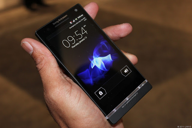
SONY XPERIA S


Its another beauty from sony. Very hot all new XPERIA S. With its 4.3 inch screen, it clearly indicates that the real opponent of GALAXY S III has reached.So Sony has paid Ericsson off with a nice little divorce settlement and is now single and ready to rock - and the result is the 12MP-camera, HD screen-toting Sony Xperia S.

Obviously, it's a line carried over from the Sony Ericsson era which saw the maker release an Xperia handset on what felt like a weekly basis. But we get the feeling that this is something a little more special.
Specs wise, it's pretty high end so should give us a great experience if we're judging it on paper. A fantastic 4.3" screen with Sony's Bravia HD technology, 12MP Exmor R camera, DLNA, Android Gingerbread 2.3 and so forth.


And it looks pretty hot too. A slab made out of glossy piano black glass with a transparent strip across the front that also acts as an antenna, this could quite easily be a swish remote for some posh Sony toy rather than a phone.


It's pretty substantial in the hand at 128 x 64 x 10.6mm, creating an impression similar to the Samsung Galaxy S2, albeit a little heavier at 144g. And also a fair bit fatter with a curved back that makes the phone feel a lot fatter than we'd have liked.


Up top, you'll find a power/unlock button and the 3.5mm headphone jack whilst the right hand side gives you volume buttons, a HDMI out socket (the cable came in our box) and a dedicated camera button.


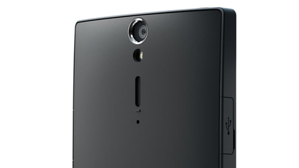
The bottom has little of interest whilst the right side guards the charging/sync port. It's behind a fiddly cap that you have to pop off which irritated us very quickly and we can't see it being too long before that ends up snapped off. It's not that it's hard to open – but you need the physical prowess of a ninja to get it back on again.


The rear holds the camera lens and LED light and interestingly, although the front of the Xperia S shows off the world famous Sony logo, the rear holds the old Sony Ericsson logo which bizarrely, Sony has elected to keep.


It's made of plastic and this is one of the downsides of the Xperia S because the top heavy weight – and the fact that the keyboard is at the bottom of the screen – means it doesn't balance well in the hand. Several times we came close to dropping it and we can see a lot of these landing on the floor.


The front of the phone is one large dark panel with a small indentation for the earpiece and the front facing 1.3MP camera. That antenna strip at the bottom which looks like three light up buttons is actually just a piece of pretty glass with the user forced to press just above them on the actual body of the screen to get any sense out of them. 


They're not particularly responsive and we found ourselves quickly tiring of their prettiness and grumpy at their rubbish responsiveness.

Still, having said that, this does feel like a very premium device and one you'll pay through the nose for. Whilst Sony and the networks won't be able to command Apple like prices, you'll still expect to part with a good chunk of your savings to get one.


Although not on general release yet, pre-order sim free prices are estimated at around the £450 mark which pits the Xperia directly against premium Androids like the Samsung Galaxy S2 and LG Prada 3.

Expect to pay at least £30 a month on a 24 month deal if you want this new pretender gratis. Black is the order of the day but there will also be a white variant. Unfortunately, that's exclusive to Phones4U so will be harder to get.

Friday 9 March 2012

Asus Transformer Prime


 The Transformer Prime created waves across the 'tabletverse' when it was announced. Powered by the Nvidia Tegra 3 quad-core chip, the device is the only quad core tablet in the market. Another noteworthy addition to the hardware list is the new Super IPS display under a Gorilla Glass panel. The screen acts not only as a major fingerprint magnet, but is also highly reflective, meaning it has a major glare problem. This is where the Super IPS display comes in. Once enabled, the screen's brightness changes to levels where the reflections are completely drowned by the display, without hurting the eyes.

The Indian market will only see the 64 GB variant hitting its shores, with the additional keyboard dock bundled into the package. The dock in itself is quite an impressive piece of hardware, doubling up as an extended battery as well. It has one USB port on the right side along with an SD card slot. The left side houses the charging port.

While the keyboard is totally functional, it is a little cramped for our liking. We found ourselves often hitting the up-arrow key instead of the shift key, leading to several typos. It took a little getting used to, but once we were familiar with the placement of the keys, we felt it would be a good idea to type up the entire review on the tablet itself. The keyboard is accompanied by a trackpad that comes with right and left click buttons and supports multi-touch.


One of the best experiences we had while using the Transformer Prime with the supplied dock was the ability to utilize commonly used shortcuts such as Alt+Tab for switching from one application to the next. The ability to use common keyboard shortcuts made us feel right at home and could definitely work in Asus's favor. Using the dock turns the Prime into a full-fledged Netbook with an immense battery life.

The USB port is something to be highlighted here. In the past, whenever tablets that have featured built-in USB ports, they have often limited its functionality. The Transformer Prime just does not suffer from this at all. We plugged in a 4GB pen drive as well as a 500GB external hard disk drive and transferred JPGs, TIFF files and blu-ray 1080p mkv rips without any issues.  It even charged our iPhone and read the photo library on it.

Performance
Since the Transformer Prime boasts an Nvidia Tegra 3 chip, we felt it was necessary to see how it performed under pressure. So the first thing we did was hook it up to our Wi-Fi and download a ton of apps from the Android Market. We also loaded every widget on various pages and ran as many apps as possible at the same time. At this point, the tablet and dock combo was at a 100% battery level.


Begin stress test at 8 am on day 1 and we multi-tasked, played games (ShadowGun HD), played music, watched a bunch of high definition movies and somewhere along the way, decided to give our laptop a day off and use the Transformer Prime for all our work related activities. The battery on the keyboard died at about 10:30 pm that day, so we removed the dock and continued using the tablet as normal; all the while being connected to Wi-Fi. By 2:30 am, we grew anxious as to why the battery on this won't die. So we cranked up the brightness to full, turned on the Super-IPS display and went to town on it watching The Dark Knight.

By 4 am, we could barely keep our eyes open, but the Prime still showed 38% battery left! That's about 18 hours of almost constant use!  Since our activity was mostly multi-media dominated, we also made notes on the music and video playback.

Our review unit came preloaded with Andriod's Ice Cream Sandwich OS (though the official unit ships with Android 3.2 Honeycomb, user-upgradable to ICS) and the built-in music player was an absolute joy to use. Besides playing pretty much all common music formats (mp3, wma, flac, aac), we were overjoyed to see the ability to create custom equalizer settings so as to get the most out of our music.


We also loaded blu-ray rips in multiple formats (1080p mkv with dual audio, 1080p mp4, wmv, divx and xvid) and fired them up one after the other to see how the media player would handle it.  That Nvidia Tegra 3 chip really seems to be a performance beast as not only did the player successfully play all the above mentioned formats, but it did so without any stutter during playback or while scrolling.

Our next performance test involved firing up a game of Angry Birds and for the first time, the birds didn't stutter as they hurled themselves towards the pigs. Game play was as fluid as one would expect it to be. Next we loaded the free edition of Fruit Ninja to see how well the Transformer Prime would accept multi-touch input. Loading up the Zen mode, we emulated the claw movements of Wolverine from X-Men and surprisingly, the processor kept up with the slicing and dicing we did using four fingers.

During the ten odd times we played each mode (Zen, Arcade and Classic), the game did not lag even once, and mind you, this is all while there were already a bunch of apps running in the background.  Since the Prime chewed through the two most popular games, we figured we'd give it a little more of a challenge and went ahead and installed ShadowGun on it.

Now ShadowGun is touted to be the only game capable of utilizing the Tegra 3 chip to the max and it surely lived up to its name. From the moment the game loads, it is just a pure visual treat. The game played through smoothly, only stuttering when we fumbled at the controls.

Camera
The Transformer Prime boasts a camera with a fast aperture of f/2.4 accompanied by a flash. What that means is that it can take photographs in low light conditions without breaking a sweat. It also features a front- facing camera for skype calls or for self portraits. We shot a few images using the auto settings and a few on custom settings and it produced  pretty good quality results. The camera also has a very small minimum focusing distance, allowing for almost-macro-like photos if need be  Just make sure you don't use flash for such purposes though. The shooting interface on the device is pretty straight-forward and very user friendly, everything being self explanatory. The 8-megapixel shooter gets its enhanced image quality thanks to its back-illuminated sensor.


The Prime can shoot full HD videos, recording them in an mp4 format that is friendly with most common media players and DLNA devices.

Shortcomings
Unfortunately, all is not peachy in the land of the Prime. There are a few important areas where we feel the tablet is lacking, such as the absence of a physical orientation lock button, something that we have gotten extremely used to being iPad users.

The second subjective drawback with the tablet is its height. Sitting in at 10.1 inches, the tablet is taller than the iPad and often feels too stretched out. Not to mention, holding it in the portrait orientation for long durations becomes rather painful, not only due to the uneven weight distribution, but also due to the edges digging into your palms.

Another area of slight disappointment was the USB port. While it did connect to every device we attached to it, it failed to recognize our Canon 40D as a camera device or as a photo storage device. This was quite a set back as the iPad can communicate with camera devices, read the image data and even email those images if needed.

It is very clear that the Transformer Prime was designed to be primarily used in landscape orientation as the tablet feels very well balanced, which was not the case when we switched to portrait mode. Even taking photos in the portrait mode felt a little awkward as the camera is placed on the center of the long edge of the tablet. The biggest setback, however, happens to be the lack of 3G connectivity. It baffles us that in the age where connectivity reigns supreme, Asus decided to leave a 3G chip out of the Transformer Prime's circuitry.


Verdict
So how much would the Prime set you back? A whopping Rs. 50,000 for the 64GB model. Again, this quote leaves us a little confused as to why Asus would price their 3G-less tablet at a price point 'HIGHER' than the iPad 2's 64GB 3GWi-Fi version. The only consolation of such a high price point would be the keyboard dock that comes as part of the bundle.

In our opinion, the Transformer Prime is a solid performer that is built rugged without compromising on the aesthetics. Whether or not it will appeal to the Indian masses still remains to be seen.


Updates
The amazing feature of the Prime is its ability to integrate seamlessly with Dropbox. Once the application is installed, it essentially creates a folder in the Prime's file-system, and it works exactly like its desktop counterpart. So when we started using the Polaris Office that comes preloaded on the tablet, we could seemlessly work with documents in our Dropbox folder. This is a great feature for those who are on the move a lot and need to keep their files updated and synchronized in multiple locations.

Polaris Office allows users to create Word, Excel and Powerpoint files along with the ability to edit such files from other common desktop counterparts. The interface takes a little getting used, to as the options are accessible through drop-down menus, but the simplicity of the interface makes it a breeze to use. Once again, common shortcuts such as Ctrl+B work just fine.

Asus offers something more than just quad-core processing and 12-core graphics for the gamer, and that is the ability to control certain games (in our case, ShadowGun HD) using a PS3 or an Xbox 360 wireless controller. Of course the controllers would need to be synced with the game.

This sets a whole new benchmark for gaming, as it allows you to connect the tablet to a television set through the built-in mini-HDMI port and then use the controller from the comfort of your couch. This offers the same experience as gaming on the console, at least for the casual gamer.


Price
64GB Wi-Fi Only with the Keyboard Dock bundled - Rs. 49,999/-

Thursday 8 March 2012

Google's new world and your privacy: Why you should worry


A significant part of your life revolves around Google. You use Gmail for work as well as personal emails. You use Google+ for virtual bonding and sharing content. You use Picassa to store photos, and YouTube for your fix of video clips. You know Google is tagging advertisements as well tailoring search depending on your web history. But, starting March 1, Google will do something more. Under its new privacy policy, it will combine data from all its services in one place, as part of its 'Google Plus Your World' programme. 


This can be useful. But also troublesome. Suppose User X watched a little too much of belly dancing video clips on YouTube. When he and his kids are using his account and are on Picassa, browsing family photos, an advertisement for a service tagged to his YouTube habits may appear. Embarrassing? Would you like more privacy? Google thinks the service will be incredibly empowering.

The New iPad


 Today marked the day of the announcement of Apple's next-generation iPad, not named iPad 3, or iPad 2S, but just iPad. Cameron covered it perfectly, with multiple posts covering things such as the name of the new iPad, 4G LTE support, the 2048x1536-pixel Retina Display, and finally, 1080p for Apple TV.

Now, let's compare the new iPad to other tablets, as well as the iPad 2, shall we? The new iPad is the third-generation iPad from Apple, which keeps its usual 9.7-inch display, but ramps up the resolution from the older, crappier 1024x768 to 2048x1536. This is an Anthony-approved resolution, I love high-res stuff.

 What's changed between the iPad 2 and the new iPad?


So we can see from there, the screen has been bumped up considerably, the CPU, well it's still a dual-core, but the A5X now. Memory-wise, it has been confirmed to be 1GB, up fron the previous 512MB. The storage stays the same, front and rear cameras get upgraded from VGA/0.7-megapixel to VGA/5-megapixel for the front and rear, on the iPad 2 and new iPad, respectively.

Other upgrades seen are Bluetooth 2.1 to 4.0, its slightly thicker, slightly heavier, and includes the same average battery life.

How does the new iPad compare to the latest tablets from other companies such as ASUS and Samsung?

Well, comparing the new iPad to say, ASUS' Transformer Pad Infinity 700, the iPad doesn't seem that great at all, really. We know the specs of the iPad, above, but the specs of the Transformer are much better. I'll put the new iPad specs in (brackets).


1.6GHz quad-core Tegra 3 chip (versus dual-core A5X), 10.1-inch Super IPS+ display (versus 9.7-inch LED-backlit IPS Retina Display), 1920x1200-pixel display (versus 2048x1536), 1GB of RAM (same), micro HDMI, 2-megapixel front-facer (versus VGA), 8-megapixel rear-facer (versus 5-megapixel), 586g (versus 652g).

As you can see, the Transformer Pad Infinity 700 pretty much dominates it, except for the screen resolution. The camera on the new iPad should be better, with its 5-element lens and IR filter.

The biggest difference between them, is the OS, of course. Apple with their iOS 5.1, versus the Transformer Pad Infinity 700's Android 4.0 Ice Cream Sandwich. This doesn't take into account Samsung's tablets (Galaxy Tab 2 10.1 or Galaxy Note 10.1) but the Transformer Pad Infinity 700 is probably the best tablet on the market to compare the new iPad to.

Wednesday 7 March 2012

How to Use TeamViewer For a Remote Connection Between Two Computers

The ability to remotely connect to a different computer is not something that one needs every day but, when that need does arise, it is usually for something important. It could be to facilitate remote assistance from a friend or technically superior person for addressing a problem you are facing. It could also be needed when you want to share something on your screen that needs to be shown to other person in real-time. Maybe you want to connect to your own computer at home from a different location.
TeamViewer provides an excellent solution to establishing remote connection between two computers and has more features than you might expect. Lets see how it works.
In order to get started you will need to follow this download link and obtain a version for Windows, Linux, Mac or mobile. On executing the download file you will have the choice to install the application or do a one-time run.


For an installed version you might choose to use the software for a personal or professional purpose. It lets you perform two major tasks- establish a remote connection or set up a meeting.

Establishing a Remote Connection

When you launch the application you will land on its Remote Control interface. Now, you may either share your ID and Password  with a friend to share your machine or acquire one from your friend to access his/her computer.


The requestor must enter the partner’s ID and hit the button Connect to Partner. Following to this you will need to authenticate the session by entering the password.


This lets you share your computer screen and have some fun, or request help from a friend. If you want your partner to interact and access an application you will need to activate it by looking for a both-sided arrow on the title bar.


If you choose your connection to be File Transfer  type, you will be allowed to send and receive files. Select the files to be transferred and destination on the other end. Hit the Send or Receive button as needed.


Setting up a Meeting

On the meeting end you might want to start a new session or join an existing one. As you may have noticed you will require your friend’s Meeting ID to join an ongoing session.


Such an ID is generated on starting a meeting from scratch. And there is no restriction on the number of people that can join. The meeting interface gives you all the privileges to share files, start a conference call and make a VOIP or video call.


You may also maintain a list of meetings by using the scheduling meetings link on the interface. It becomes a part of your profile.

Creating an Unattended Access

This feature allows you to create standalone session for you to be able to access it anywhere. It is associated to the Connection tab and requires you to register and create a user profile.


Before this you will need to choose a password for such a connection. Following that you will be able to access your machine remotely by logging into your account.


Provisions are available to use the Team Viewer application or the web service (navigate to the website) for such an approach.

Windows 8: Microsoft Gambles on a Tablet-centric Future


Earlier this week, Microsoft released a sneak peak of Windows 8, the next major rethink of its operating system, which is expected to go on sale later this year.
As tablets and smart phones have started to replace desktops and laptops, and as increasingly sophisticated Web services have grown in importance, Microsoft has fallen behind the likes of Apple, Google, and Facebook in providing the software that most people use every day. Windows 8 represents an attempt to catch up and remain relevant.
Although unfinished (and subject to significant changes before its official release), Windows 8 looks set to be the most radical reinvention of Microsoft's operating system since Windows 95. It blurs the line between desktop and mobile computing, and contains some clever tricks that could help Microsoft push into mobile, social networking, and consumer cloud services. But the combination of a tablet and a desktop interface may also prove confusing for some users.


I didn't test Windows 8 on a touch-screen device, but then most people will encounter Windows 8 on a new laptop or desktop. While 62.5 million tablets were sold in 2011, according to IDC, that's only 15 percent of all the PCs sold.
Instead of developing one version of Windows for tablets and another for desktops—as Apple has done with OSX and iOS—Microsoft chose to build an operating system that does it all. It's an approach that makes sense for Microsoft, since it will help introduce users to its mobile operating system.
After installing this Windows 8 preview, the first thing you'll notice is that, instead of the familiar Windows desktop, you're met with a series of tiles, each representing a different application or online service. This new start screen is based on Metro, the interface Microsoft created for Windows Phone, and it includes many of the same features as that OS. Each tile can be more than just a button, showing the latest updates from a program underneath—a new e-mail message, Facebook post, or tweet, or an upcoming calendar event. And it's simple to rearrange the tiles to make all this information accessible at a glance.

The regular Windows desktop is still there, it's just hidden underneath this start screen; one of the tiles on this screen will still take you to a familiar-looking Window 7-like interface—complete with windows, a task bar, and normal Windows applications. But it's impossible to use the OS without returning to the Metro start screen every time you want to start an application. By right-clicking on the bottom left corner of the screen, you can access things like control panel, search, run, and the command prompt.
Even on a nontouch screen device, the Metro-style interface is intuitive and slick. It feels very different from any previous version of Windows, and distinct from either Apple or Google's mobile operating systems. Windows 8 also comes with several tablet-style apps, which are shown on the start screen, as well as Metro versions of existing applications like Mail and Internet Explorer.
I found the Metro version of some apps, like Internet Explorer 10, surprisingly enjoyable even on a desktop computer—all of the browser "chrome" disappears while you're reading a webpage; the useful stuff (the address bar, tabs, settings) returns with a click or a swipe. But having two versions of certain apps, and thus two different ways of doing things, could prove confusing for some people.


Using a regular mouse and keyboard with the Metro interface can be clunky. Opening and closing apps, for instance, requires grabbing them from the top and pulling them to the bottom of the screen. Some Metro apps, like the Finance one, are probably well-suited to a tablet but felt out of place on a regular PC.
Merging the two interfaces means the Windows button is replaced by the Metro start screen. In the conventional desktop mode, clicking the bottom left corner of the screen, or hitting the Windows button on your keyboard, simply returns you to the start screen. This takes some getting used to, and it seems like a compromise made at the expense of usability on an ordinary laptop or desktop.
Another big change with Windows 8 is its connection to the cloud. Whenever you log into another machine running Windows 8—with an e-mail address and password tied to Windows Live—you'll see the same start screen and have all your other preferences in place. It's a smart move, and most people will find it convenient.

 You can also connect your Windows 8 (and Windows Live) account to various online services—Facebook, Twitter, LinkedIn, etc.—and these will also automatically be set up when you log in somewhere else. And, of course, you'll have access to all the documents you've saved on Microsoft's cloud service, SkyDrive.
Again, though, these cloud features work best in the Metro mode—I couldn't see a simple way to access SkyDrive from regular old Windows Explorer, for example.
Windows 8 also tries to be the glue that holds your online social life together—another innovation borrowed from Windows Phone. An app called People grabs contacts from online services like Facebook and Twitter (with your permission, of course) to create a single address book and social platform. The app shows Facebook and Twitter updates neatly together, and lets you reply, post, and comment without ever leaving Windows 8.
Once a Facebook friend has connected his or her account to Windows 8, you can chat live via Microsoft's Messenger app, and other Windows 8 apps are designed to encourage sharing via the People App. Many people will probably find this useful, but since it lacks the nuances of the actual Facebook or Twitter interfaces, it seems an innovation best suited to a mobile device.
Windows 8 introduces an app store, similar to Apple's and Google's. It's sparsely populated at the moment (I found only three "social" apps, for example), but that's hardly surprising given that the OS is still in development.


In fact, Windows 8 clearly presents a neat opportunity: putting a tablet and desktop OS together should encourage Microsoft's army of developers to start building many more tablet and mobile Windows apps. From now on, if you're developing a desktop app for Windows 8, it'll make sense to make it tablet-compatible from the start. Microsoft has also released development tools to make it easier to build programs that work both as Metro apps and desktop applications.
Overall, Windows 8 shows an impressive amount of innovation, and many of its features promise to work extremely well on touch-operated devices. But the decision to merge the Metro interface with a conventional Windows desktop, while clever from a strategic perspective, is a bit frustrating. Given enough time, I'm sure I'd get used to Windows 8's split personality; but I'm not sure it would make any more sense.

Powered by Blogger.
Related Posts Plugin for WordPress, Blogger...